Design system
What every new component should look like. Built from the site's real CSS, so it never drifts out of date.
Part 1
Structure
Bootstrap style page structure, built in Tailwind. Four layers, always in this order.
| Layer | Class | Job |
|---|---|---|
| Section | <section> |
One block of the page. Sets vertical rhythm (py-16 marketing, py-8 product). |
| Container | .container |
Centres content, caps width at 1220px, adds side padding. |
| Row | .row |
Flexbox, not CSS Grid. Wraps, negative margin lines up columns, gap-y-8 spaces stacked columns on mobile. |
| Column | .col |
Paired with a Tailwind width, e.g. md:w-1/2. |
<section>
  <div class="container">
    <div class="row">
      <div class="col md:w-1/2">...</div>
      <div class="col md:w-1/2">...</div>
    </div>
  </div>
</section>
- Never nest
.containerinside.container. One per section. - A row of columns always needs
.rowas the wrapper, even for one column..coldepends on the row's negative margin and gap. - Not Bootstrap's own classes, no
.col-md-6. Widths are plain Tailwind fractions (w-1/2,w-1/3,w-1/4...), but they are still built on a 12-column base, so columns of different widths line up across rows. - CSS Grid is not used anywhere on the site.
Part 2
Foundations
Marketing and product tracks
Marketing pages (Belong, Placid, case studies, principles) and product pages (Spoke, Bearing) are styled differently, on purpose.
| Marketing | Product | |
|---|---|---|
| Section rhythm | py-16 |
py-8 |
| H1 font | Mochiy Pop One (font-serif, default) |
Bitter (font-sans override) |
| H2 size | text-3xl |
text-xl |
| Corner radius | rounded-2xl |
rounded-md |
| Focus states | Global outline | .input-focus-ring on every field |
Marketing
Inspiration for inclusion
Generous space, a display headline, primary colour throughout.
Product
4.1 Local authorities must publish a Local Offer
Dense rhythm, functional heading, colour saved for status and actions.
Typography
Every bare <h1> to <h6> gets text-wrap: balance automatically. No orphan word on a heading's last line.
Marketing and product share the same scale. H1 font and H2 size differ by track, see Marketing and product tracks above. H3 and the named classes below are the same on both.
This is what an h1 looks like
font-serif text-3xl/snug lg:text-4xl/snug. Base rule for a bare h1, marketing pages need no class. Product overrides with font-sans, see the tracks table above. One h1 per page.
This is a real h2
Marketing size shown here. Product uses text-xl instead.
This is a real h3
A card or content subheading. Smaller and more frequent than a section's one h2.
A section-title heading
.section-title. A section's one major heading, marketing size only.
Belong
.eyebrow. Small bold label above a hero, naming what the thing is. Skip it if the h1 already says it.
Together, today and tomorrow
.hero-tagline. The line between .eyebrow and a hero's h1.
Photo by Jonny Holden
.photo-credit. Under a hero image, base size like everything else.
Nothing below 16px
- No text anywhere under the 16px base. None of Tailwind's smaller text-size utilities (the ones a size code like "sm" or "xs" would pick), no stylesheet size under
1rem. - Hints, captions, tags, table cells, photo credits: all base size. Secondary feel comes from colour and weight, not size.
- Check:
grep -o 'text-\(sm\|xs\)\b' site/templates/*.phpshould print nothing.
This is body text at the base size.
This is secondary text. Same size, quieter colour.
text-dark-600 for secondary text, not a smaller size
Inclusion Draft
.tag and .tag-neutral at base size too
Colour
- Full scales live in tailwind.config.js.
dark-200is the card border colour. Always paired with a shadow, since border alone is only about 1.24 to 1 contrast.- Info, success, warning and danger are each checked at 4.5 to 1 contrast or better against white. Full rationale on the wiki.
Primary
50
#fdf4f8
100
#fedfe8
200
#fbbace
300
#f598b7
400
#ee76a2
500
#e6528e
600
#dd227c
700
#c30067
800
#a50050
900
#870039
950
#680023
Secondary
50
#fdf2f8
100
#fce7f3
200
#fbcfe8
300
#f9a8d4
400
#f472b6
500
#ec4899
600
#db2777
700
#be185d
800
#9d174d
900
#831843
950
#500724
Tertiary
50
#f5f3ff
100
#ede9fe
200
#ddd6fe
300
#c4b5fd
400
#a78bfa
500
#8b5cf6
600
#7c3aed
700
#6d28d9
800
#5b21b6
900
#4c1d95
950
#2e1065
Dark
50
#f9fafb
100
#f3f4f6
200
#e5e7eb
300
#d1d5db
400
#9ca3af
500
#6b7280
600
#4b5563
700
#374151
800
#1f2937
900
#111827
950
#030712
Light
50
#ffffff
100
#f3f4f6
200
#e5e7eb
300
#d1d5db
Neutral
50
#f5f5f5
100
#e9e9e9
200
#d0d0d0
300
#b7b7b7
400
#9f9f9f
500
#858585
600
#646464
700
#464646
800
#3a3a3a
900
#2f2f2f
950
#232323
Info
50
#f2f4f8
100
#dee4f2
200
#b1c2e7
300
#7394de
400
#4d7be0
500
#376ee6
600
#2563eb
700
#1147bd
800
#0e3a9a
900
#0b2f7d
950
#092564
Success
50
#f2f8f2
100
#e1f2de
200
#b9e7b1
300
#81de73
400
#48bb37
500
#379e28
600
#2b861d
700
#216616
800
#1b5312
900
#16430f
950
#11360c
Warning
50
#f8f4f2
100
#f2e7de
200
#e7cab1
300
#dea373
400
#e17821
500
#cc6712
600
#b8590a
700
#8c4408
800
#723706
900
#5c2d05
950
#4a2404
Danger
50
#f8f2f2
100
#f2dede
200
#e7b1b1
300
#de7373
400
#d55050
500
#d83a3a
600
#dc2626
700
#a91b1b
800
#8a1616
900
#6f1212
950
#590e0e
Link
Default link colour is Primary (shown above), from the global a rule. Every link is coloured and underlined, everywhere (see Design principles).
On a pale tinted box, links use Primary 700 instead. Primary only just passes contrast on white (4.57 to 1) and fails on every pale tint, so any link inside a 50 or 100 background, or bg-light, turns darker by itself (4.6 to 5.7 to 1). The rule is at the end of tailwind-source.css. Add any new pale background to its list.
A separate flat colour, text-link, exists only for one narrow case: a course lesson list's not-yet-done links (done ones use Tertiary instead).
link
#1d4ed8
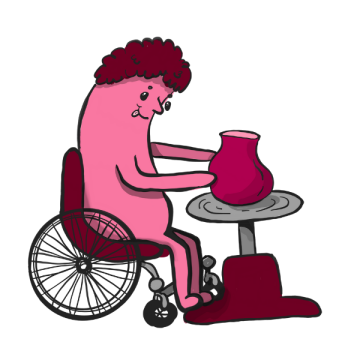
Blob characters
- Our illustrations. The drawn share cards use them too.
- In the Image Library, tagged blob. Use Choose from library to put one in any image field.
- Add, remove or re-describe them in the Brand images field on this page. This section follows.
- The words under each one are its image description, which screen readers read out.











Part 3
Components
Cards
Border plus shadow define the edge. Border colour alone is not enough contrast on its own. Radius: rounded-md product, rounded-2xl marketing (shown here).
Pick the pattern by what the box does, not by looks: is the whole thing one link, does it hold exactly one button, or is there nothing to click?
Accessible
One of the five Local Offer principles.
Whole card is one link. .card plus .stretched-link on the heading. Never wrap the card itself in an <a>.
Exactly one button inside. Card is not a link, only the button is, sized to its own text.
153 councils
A stat, an aside, a category explanation. Nothing in it links anywhere.
Nothing to click. .panel, not .card. Flat fill, no shadow, no border. The moment it needs a link, make it a card.
A button inside a flex-column card needs its own wrapper (a <p>), or it stretches full width.
Short version
One line of text.
Long version
The same card, with a summary running to two or three lines instead of one.
Belong The Universal Offer Agreement
A coloured eyebrow bar over a tinted body, one heading with the eyebrow label folded in.
.card-feature. Home page product intros only. Rare, not a general option.
Testimonial speech bubbles
- Six hand-drawn illustrations, not a CSS shape. Used on Belong and Spoke's marketing page.
- Auto-rotates through the six by list position, or an editor can pin a shape and nudge the text.

"So much easier than the old website."
Oval, pink fill

"So much easier than the old website."
Oval, outline only

"So much easier than the old website."
Rectangle

"So much easier than the old website."
Rounded square

"So much easier than the old website."
Starburst

"So much easier than the old website."
Thought cloud
testimonialBubbleShapes() / resolveTestimonialBubble() in _init.php.
Blockquote
For a quote inside flowing rich text: a newsletter pull quote, an interview excerpt, a Code of Practice citation. For a real standalone testimonial, use the speech bubbles above instead.
The new Local Offer is so much easier to use, and we don't get lost in the council's own website like we used to.
Calderdale parent carer
- Tinted card, primary-600 left border, no decorative quote mark.
- Use a real
<cite>for the attribution, not a second plain paragraph. - No attribution is fine. Most Code of Practice citations have none.
Post-it notes
A torn or taped sticky-note illustration as a card's background image, one per SEND Local Offer principle. hero_bg_image on the "principle" template.
Real per-page art, not a reusable class, so it is not reproduced here. See it live: Accessible. On a page showing several, do not wrap it in .card. Keep rounded corners and a plain shadow, drop the border.
Buttons, tags, and CTA banners
One .btn-primary per group, the rest .btn-outline. Never two solid buttons in one group. Two outline buttons is fine when neither is the default.
Inverse variant is for a dark background only, not a second way to mark a secondary action.
.tag for topics, .tag-neutral for classification. One recipe each.
Book a demo of Belong
See how Belong can help SENCOs, teachers, and TAs
One radius, rounded-2xl, always.
Focus states
Product track inputs get a visible ring on top of the global outline. Tab into the field below.
Same ring on .card/.card-feature at :focus-within, and on Spoke's .status-pill/.ghost-field.
Status icons
Border plus symbol, not a filled background, so a status stays quiet until it matters. CC0 icons from SVG Repo, kept in site/templates/icons/.
Main use: a form field that has failed validation
Enter a full web address, starting with https://
Product icons
One icon per product or page, matched to its name, not a generic glyph. productIcon($name) / productIconName($name) in _init.php. Every distinct icon the map resolves to, one label per icon (several keys can share one icon, e.g. "bearing" and "bearings").
w-4 h-4 in the nav dropdown, w-5 h-5 white on a .card-feature-bar.
Inline icon codes
Every icon in site/templates/icons/ with the code that puts it inline in rich text. Copy the code, paste it into the editor where the icon should go. Works today in the AI search walkthrough's cover page intro and step screens (aiSearchInlineIcons()); it renders sized to the text, in the accent colour.
-
{{ICON:ai}} -
{{ICON:bearing}} -
{{ICON:belong}} -
{{ICON:blog}} -
{{ICON:book-open}} -
{{ICON:book}} -
{{ICON:briefcase}} -
{{ICON:bullseye-cursor}} -
{{ICON:chevron-down}} -
{{ICON:clipboard-list-check}} -
{{ICON:code}} -
{{ICON:comment-ellipsis}} -
{{ICON:copy}} -
{{ICON:danger}} -
{{ICON:dawn}} -
{{ICON:envelope-open}} -
{{ICON:envelope}} -
{{ICON:everysend}} -
{{ICON:external-link}} -
{{ICON:file}} -
{{ICON:gear}} -
{{ICON:info}} -
{{ICON:library}} -
{{ICON:life-ring}} -
{{ICON:link}} -
{{ICON:local-authority}} -
{{ICON:location}} -
{{ICON:mail}} -
{{ICON:map}} -
{{ICON:message-ellipsis}} -
{{ICON:message-lines}} -
{{ICON:microphone}} -
{{ICON:mobile-heart}} -
{{ICON:opensenddata}} -
{{ICON:phone}} -
{{ICON:placid}} -
{{ICON:post-it}} -
{{ICON:quote}} -
{{ICON:rocket}} -
{{ICON:search}} -
{{ICON:spoke}} -
{{ICON:success}} -
{{ICON:target}} -
{{ICON:user}} -
{{ICON:users}} -
{{ICON:video-camera}} -
{{ICON:warning}} -
{{ICON:workspace}}
Nav "Products" dropdown
Native popover attribute, not <details>. No JavaScript for open, close, escape, click outside or focus return. Try the real thing below.
Positioned with CSS anchor positioning. Chevron rotates via :has(). One feature-detected polyfill script, skips itself where the browser already supports it.
Spoke's item table
Compact row per checklist item, not one big card each. Loud .status-pill for status, near-invisible .ghost-field for responsibility and notes.
4.1 Local authorities must publish a Local Offer
A real <details>/<summary> holding a real <h4>. Screen reader users can navigate up to 57 items in a section by heading, not by tabbing one at a time.
Every real status label, auditStatusPillClass($status) in _init.php
.status-pill-static for read-only display (Spoke's Views/Gaps pages). Same shape and colour, no dropdown chevron, since there is nothing to click. 9 labels, 5 real colours. Policy, Strategy and Settings share tertiary. To Do and Nothing share dark.
Details, folded content
The general form of the table row above: a native <details>/<summary>, class .disclosure, for content that is secondary and most people will not need. Never for the main task, and never for something the page is incomplete without. Keyboard, screen reader (announced expanded or collapsed) and find in page (the browser opens a closed one when the search matches text inside) all come free, with no JavaScript.
Rules: the summary holds a real heading at the right level for the page, so it can be reached by heading. Native marker hidden, a + or – at the right end instead. Closed by default. Body content in .disclosure-body. Several in a row is fine for a few folded extras; a set of sections the reader works through is a different thing, and not this. Seen live under the Start button on the AI search walkthrough.
Why is the border only at the bottom?
Can the summary hold an icon?
Part 4
Rich text (.field-html)
Shared .field-html h2/h3/h4 rules set weight, size and margin. Weight is global (font-weight: 600), the same on every heading level everywhere, no class needed. Size and margin genuinely vary by content shape, so those stay per-template.
Check this table before writing a new template. A size nobody styled for falls back to the global default (1.5rem h2, 1.25rem h3). That default is a middle ground: too small for a standalone article's own section heading, too large for a compact sidebar card. Pick the row that matches the content's shape instead of trusting the fallback.
| Content shape | Recipe | Example templates |
|---|---|---|
| Whole article, own heading may lead the field | [&_h2]:text-2xl ... [&_h3]:text-lg ... |
procurement-document.php, newsletter-edition.php, blog-post.php |
| h3 only, section's real h2 sits outside .field-html | [&_h3]:text-lg ... |
case-study-detail.php, engagement-framework.php |
| Single h2, no lower level, the block's one title | [&_h2]:text-{lg|xl|2xl|3xl} ... |
belong.php (text-3xl), project-planning-tool.php sidebar (text-lg) |
Everything else is safe globally, no per-template opt-in
- Heading weight, as above.
- Nested lists: a sub-list does not add its own trailing gap.
<dl>/<dt>/<dd>: bold term, indented definition.<a>: one global rule, no per-template gap possible.<code>: Tailwind's monospace stack, free.
Part 5
Motion and focus
- prefers-reduced-motion: one media query cuts every animation and transition to near zero, automatically, everywhere.
- :focus-visible: one base rule gives every element a visible outline. The two places that remove it replace it with a ring at least as visible.
Part 6
Design principles
-
1
Never use full capitalisation, anywhere
Not in an eyebrow bar, a tag, or a badge. Always sentence case.
-
2
Every link is coloured and underlined, everywhere
Colour alone fails colourblind users. A button or card style (
.stretched-link,.btn) may drop the underline. Plain inline text links never do. -
3
Section rules apply to one major heading and the section's own padding
Not to card titles or one-off inner spacing. Those are a smaller, different role.
-
4
Shared components, per-track overrides
.cardand.card-tintare shared. Marketing'srounded-2xlis a per-use override, not a change to the default. -
5
A card's title needs a real heading element
Not a styled span. Screen readers navigating by heading skip a span standing in for one.
Full detail on the Design system wiki page.
Part 7
Product track status
Spoke and Bearing use the product track above. Spoke's own pitch page, spoke-marketing.php, is a separate template, deliberately marketing track.