Case study
Calderdale SEND Youth Representatives logo

The starting point
The group of young people who represent children and young people with SEND in Calderdale were originally called the SEND Reference Group. They decided to change the name, and wanted an identity to go with it.
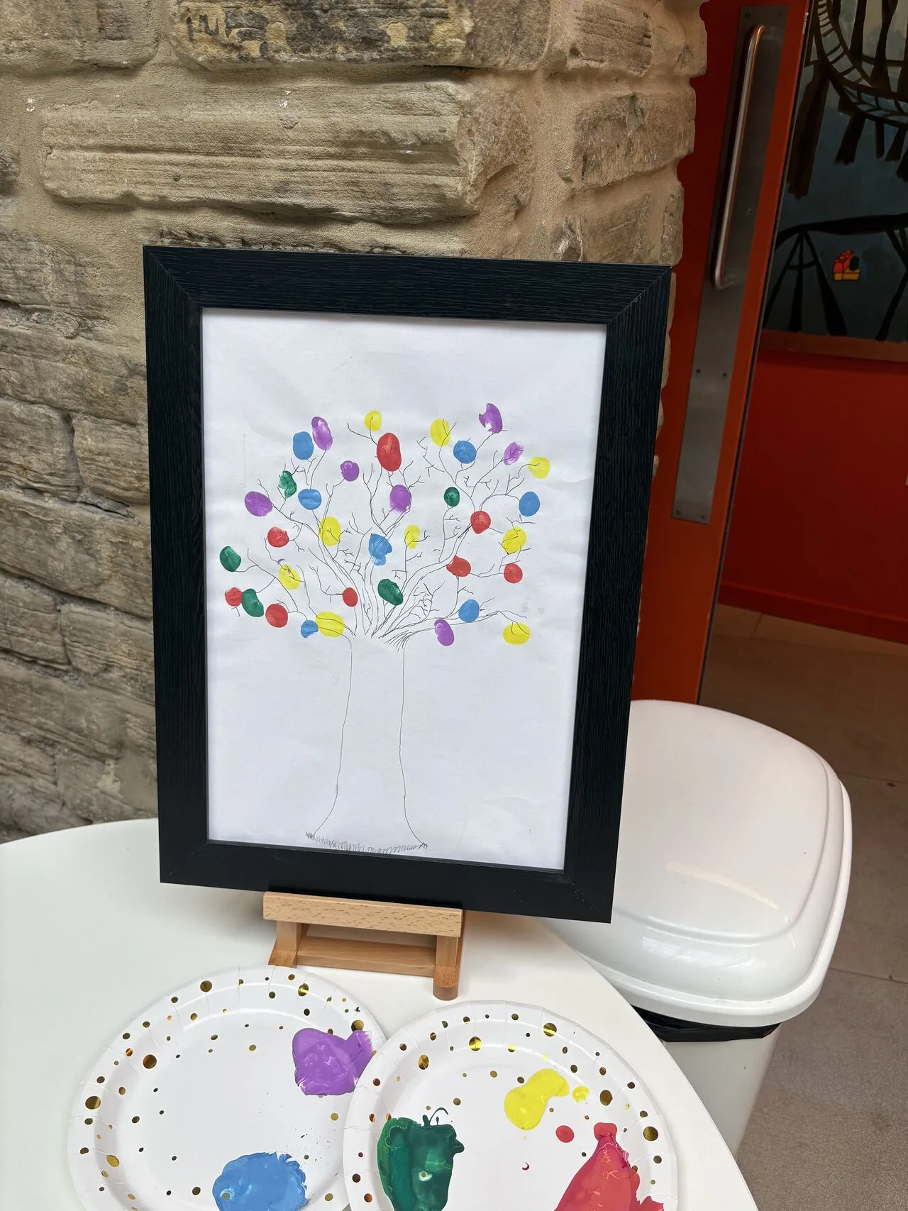
The idea behind their sketch was that the words at the bottom represented the roots from which all the young people could grow. The leaves in different colours represented the variety of disabilities.
The development of the idea
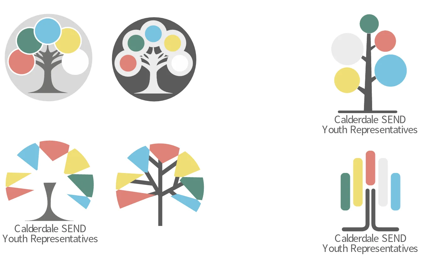
There were many ideas explored in discussion with the young people.
The final logo, 4 ways

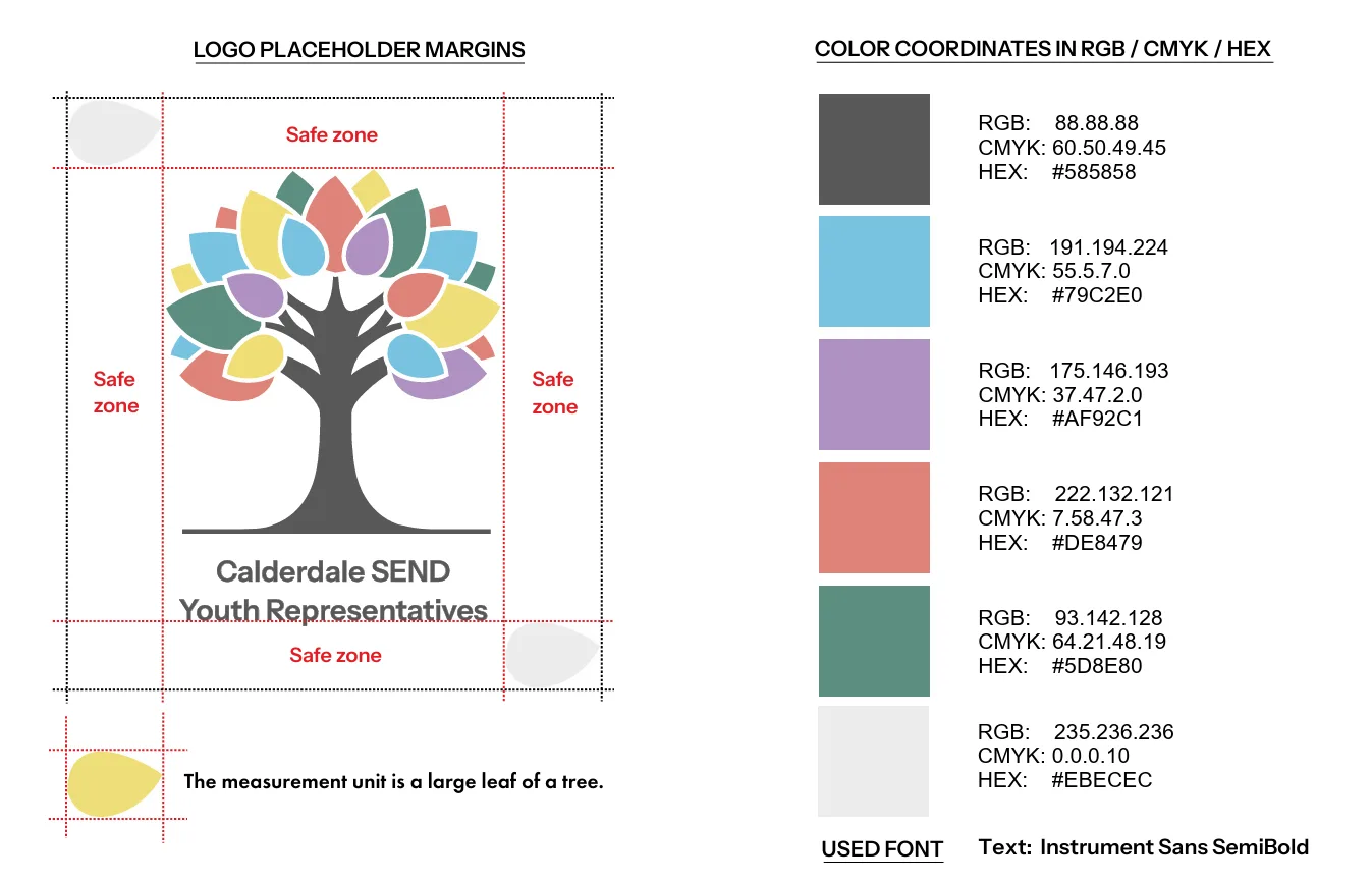
Brand guidelines
The logo in action
In July 2025, the SEND Youth Reps organised a Disabled Pride event, and one of the activities was to add a fingerprint to an image of a tree.